Source: _style-settings.scss
- Colors
- Accessibility
- Workspace
- Status bar position
- Ribbon position
- Left sidebar toggle button out of ribbon
- Vault menu at the top
- Show note header on hover
- Also crop the corners of the central pane
- File explorer
- Sidebars
- Bookmark style for the tabs
- Gap between the selected tab and the content in the sidebars
- Color of the inside border
- Use custom sidebar texture
- Sidebar texture url
- Sidebar texture blending mode
- Sidebar texture size
- Sidebar texture position
- Sidebar texture opacity
- Use custom file explorer decoration
- File explorer decoration url
- File explorer decoration blending mode
- File explorer decoration size
- File explorer decoration position
- File explorer decoration opacity
- Animate the hover effect in the file explorer
- Editor
- Features
- Skins
- Additional content
Colors
Light color scheme
Choose a predefined color scheme for the light mode.
Dark color scheme
Choose a predefined color scheme for the dark mode.
Opposite bacgkround
When enabled, the overall background of the app will be light in dark mode, and dark in light mode.
Custom - Primary
Select the background primary color for light and dark mode with the color scheme “Custom”.
Custom - Text
Select the text color for light and dark mode with the color scheme “Custom”.
Custom - Gradient color space
Select the color space for the gradient mixing with the color scheme “Custom”.
The base color gradient goes from the primary background to the text color. The interpolation is made in a certain color space. Each color space will give a different gradient.
If you don’t know what to choose, I would suggest srgb-linear for both modes, or lab for dark mode.
Note accent colors
Change the color accent for the cssclasses note-accent-i.
Accessibility
Enable Accessibility variant
This option makes the vault easier to read, with sans serif fonts, and increased font size and weight.
Use sans serif font
Increase default font size and weight
Background textures
Enable the background texture in the sidebars.
Inline margin (left/right) for float elements
Modify the space between the floating elements and the text. Float elements are for example the fas-infobox callout, the polaroid callout, floating images, etc.
Scrollbars width
Icon opacity in inactive tabs
Modify the opacity of the icons in inactive tabs.
Workspace
Status bar position
- (none): default position
- Default on hover: default position, show on hover only
- Top: at the top of the window
- Ribbon: split the ribbon space in two, the status-bar goes in the bottom part
Ribbon position
- (none): default position
- Floating horizontal, bottom: at the bottom left corner, always visible
- Floating horizontal, bottom, on hover: at the bottom left corner, only shown on hover
Left sidebar toggle button out of ribbon
Place the toggle sidebar button in the central pane, on the opposite side of the right sidebar toggle button. Incompatible with the floating ribbon options.
Vault menu at the top
Place the vault menu at the top of the left sidebar rather than the default bottom.
Show note header on hover
Hide the note header by default and reveal it only on hovered.
Also crop the corners of the central pane
Make the left/top corners circular - like the sidebars - in the central pane when the sidebars are opened.
File explorer
Indentation for files and folders
Left indentation of each child of a folder in the File explorer and the Bookmarks tree.
Vertical spacing for files titles
Change the padding of each file title in the File explorer and the Bookmarks tree. Since each item has its own padding, the actual space between two items is doubled (or summed with the padding of folder titles, depending on what is preceding/following).
Vertical spacing for folders titles
Change the padding of each folder title in the File explorer and the Bookmarks tree. Since each item has its own padding, the actual space between two items is doubled (or summed with the padding of files titles, depending on what is preceding/following).
Sidebars
Bookmark style for the tabs
Gap between the selected tab and the content in the sidebars
Color of the inside border
Change the color of the border of panels inside the sidebars
Use custom sidebar texture
Enable to use your own custom texture instead of the default paper one
Sidebar texture url
Url to the image for the sidebar texture. Use it as follow: url("https://path/to/file.png")
Sidebar texture blending mode
Blending mode for the background texture (one for each ligh/dark mode)
Sidebar texture size
Size of the background texture
Sidebar texture position
Position of the background texture
Sidebar texture opacity
Opacity of the background texture. Should be between 0 and 1.
Use custom file explorer decoration
Enable to use your own custom texture instead of the default paper one
File explorer decoration url
Url to the image for the file explorer decoration. Use it as follow: url("https://path/to/file.png")
File explorer decoration blending mode
Blending mode for the file explorer decoration (one for each ligh/dark mode)
File explorer decoration size
Size of the file explorer decoration
File explorer decoration position
Position of the file explorer decoration
File explorer decoration opacity
Opacity of the file explorer decoration. Should be between 0 and 1.
Animate the hover effect in the file explorer
If enabled, hovering on files and folders in the File Explorer will have an slide-in animated effect.
Editor
File line width
Set the file line width (width of notes).
If you change this value, the asides elements might not switch correctly between in-text/in-margins positions.
Callouts
Theme quote callout
Enable to use the Fancy-a-Story specific style for the quote and cite callouts (the style can still be used with cite-fas or quote-fas callout types if you keep this option disabled).
Use > [!infobox]
Enable the usage of infobox as an alias for fas-infobox. Only check this option if you are not using ITS’s callout adjustments snippets.
Default color for callouts
Change the default color for callouts to something else than the default blue. Every callout with a specific callouts will not be affected. This goes for every official callout types, as well as for some custom callouts from this theme (such as the screen callout, the paper-fold, etc.).
Code
Limit code to 80 characterss
Use the standard brought to us by the IBM’s 1928 punch card format and limit the number of characters to 80 for your code (only affects reading mode).
Headings
Color for the headings
n-th level headings
Appearance
Color
Specific color for the heading level. Overriden if you choose a global way to compute all headings color (hue, complementary hue, accent, or rainbow).
Font size
Font size for the heading level, in em. Overriden by the Display apperance if you select it.
Weight
Font weight for the heading level. Overriden by the Stroke apperance if you select it.
Variant
Font variant for the heading level.
Line height
Line height for the heading level. Overriden by the Display apperance if you select it.
Style
Font style for the heading level. Overriden by the Display apperance if you select it.
Images
Shadow offset (px)
The theme adds by default a striped shadow to the embed images. You can change the offset of this shadow.
Trick 1: Make it 0 to make the shadow disappear.
Trick 2: Make it negative to keep the shadow exactly under the image (like if it was offset 0), but still display it under transparent images.
Shadow stripe thickness (px)
Thickness of the stripes of the image shadow
Shadow stripe gap (px)
Gap between the stripes of the image shadow
Center images
If enabled, the images will be centered if they are not in a paragraph (one empty line before and after)
Links
Internal link decoration
Choose between
- none
- doodle (on hover)
- underline
- overline
- underline overline
External link decoration
Choose between
- none
- doodle (on hover)
- underline
- overline
- underline overline
Lists
Bullet style
Choose between
- Doodle style
- Normal style (no additional styling)
Checkbox style
Choose between
- Doodle style
- Normal style (no additional styling)
See tasks for screenshots.
PDFs
Blend mode, light mode
Blending mode for the PDFs in light mode. Multiply is a often a good choice.
Blend mode, dark mode
Blending mode for the PDFs in dark mode. Screen or exclusion are often good choices if you have the “Invert in dark mode” enabled.
Invert in dark mode
Invert your PDFs in dark mode.
Properties
Number of columns
Number of columns for the frontmatter properties. If the note is smaller than 600px, only one column will be displayed.
Label width
Change the width of the properties labels (also called keys, or names).
Tables
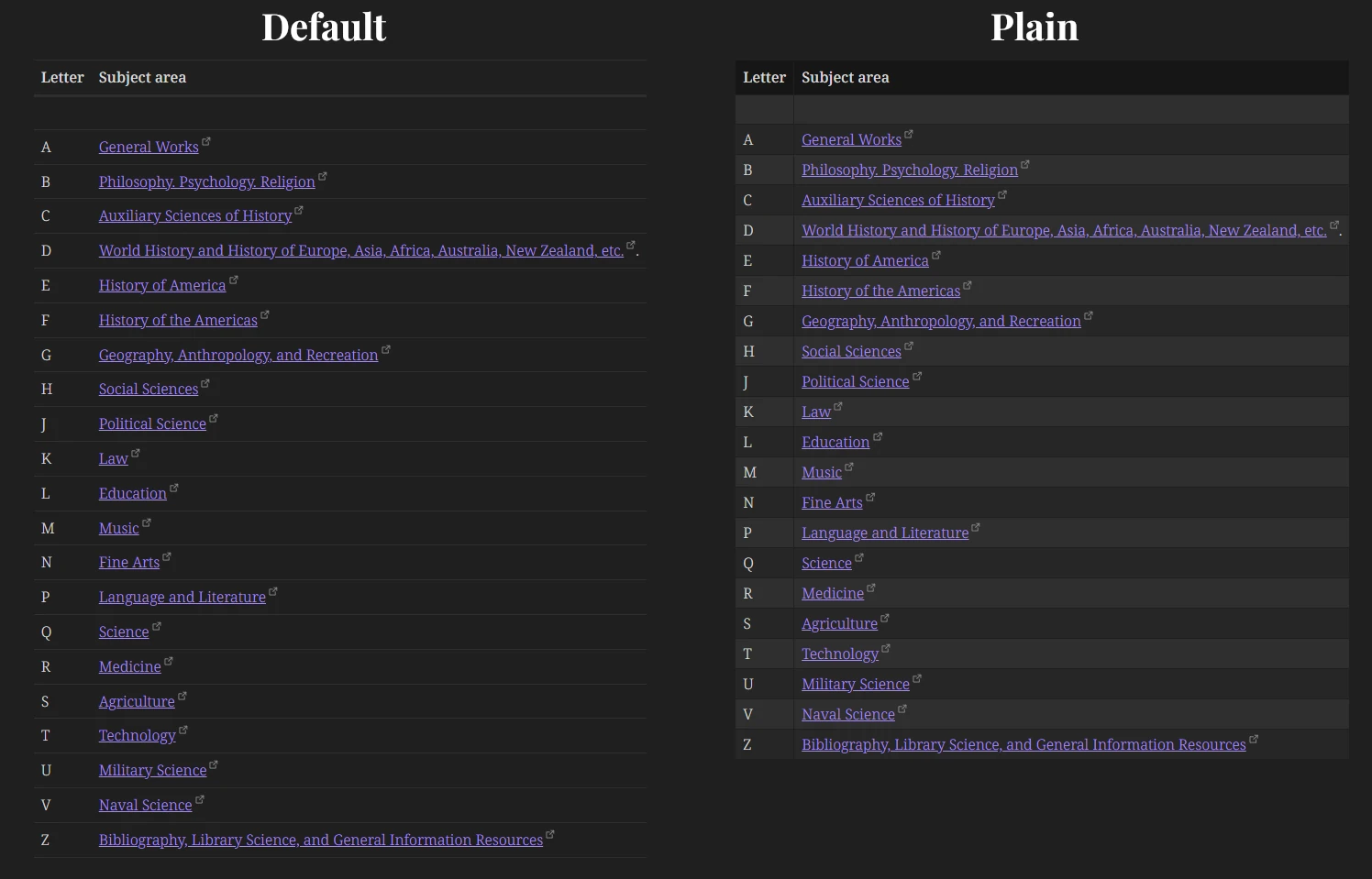
Table style
Default, with borders, or plain
Table position
Horizontal position of the table in preview mode.
Wrap in source mode
Wrap the table code in source mode so it isn’t wider than the note.
Typography
Bold text color
Italic text color
Highlight background color
Highlight text color
Pen highlighter effect
Add a skeuomorphic effect to the highlights. Works better in light mode.
Features
Alternative checkboxes
Choose between
- Doodle style
- Normal style (mainly Lucide icons)
- Disabled
See tasks for screenshots.
Floating button to switch note modes
Idea from the Thing theme, by colineckert, under MIT License.
The button to switch between editing and reading modes can be made floating.
The following css variables are used to define the button:
| Variable | Description | Default value |
|---|---|---|
--fas-floating-mode-button-color | Color of the button | var(--color-accent) |
--fas-floating-mode-button-icon-color | Color of the icon | white |
--fas-floating-mode-button-size | Size of the button | 50px |
Floating button position
Position of the floating button (to switch between editing and reading modes) on the screen.
You can also change the following css variables in a snippet:
| Variable | Description | Default value |
|---|---|---|
--fas-floating-mode-button-space-inline | Left or Right margin | 20px |
--fas-floating-mode-button-space-bottom | Bottom margin | 50px |
Highlight active note
Idea from the plugin Obsidian Limelight, by smikula, under MIT License.
Code adapted and shared by @tif on Discord. Thanks a lot!
Lower the opacity of non active notes.
Rainbow folders
Enable rainbow colors in the file explorer, for the top level folder
Rainbow lists markers
Enable rainbow colors for lists markers. The coloring effects are different in livre preview (each line has a new color) and preview mode (the color changes only on the first depth items).
Rainbow text brightness/saturation
Adjust the brightness and the saturation of the rainbow colored text. Doesn’t affect ordered lists number markers in preview mode.
App background image
Add a background image for the whole app.
Enable app background image
Image url
Must be either:
- the web url of an online image;
- the base64 encoded url of an embed image.
Blur
Opacity
Notes background image
Add a background image to every note. See the cssclass background-image.
Enable note background image for all notes
Image url
Must be either:
- the web url of an online image;
- the base64 encoded url of an embed image.
Blend mode, light/dark mode
Repeat background image
Blur
Opacity
Brightness light/dark mode
Export to PDF
Use the note’s background when exporting the note to PDF.
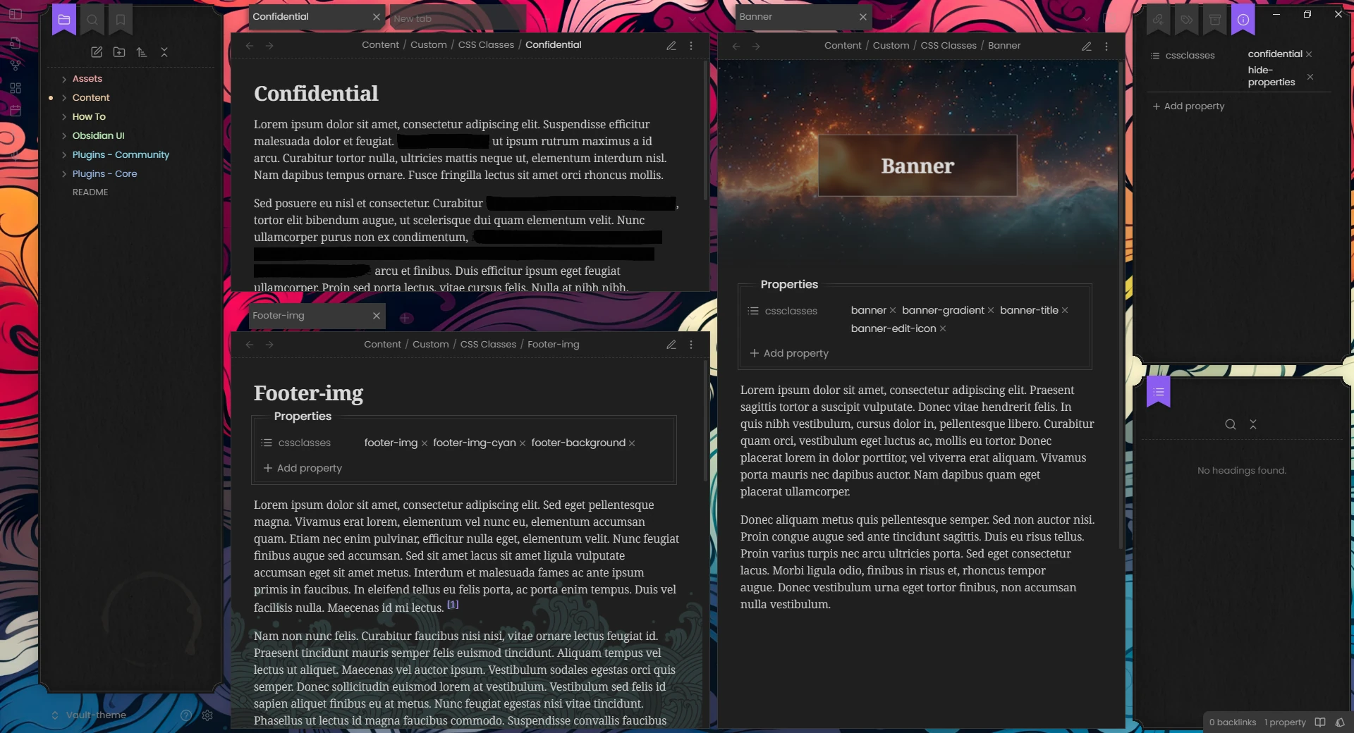
Banners
Banner height
Height of the banners when set by the cssclass banner.
Banner slope angle
Angle of the slope for the banner-slope or banner-slant cssclasses.
Banner width in print mode
Define the type of banner for PDF exports. Full bleed will make the banner go from on edge to the page to the other. Inside margins will not cover the margins in order to leave free space for printing.
Banner style in edit mode
Select how the banner image will be displayed edit mode.
- Hidden will completely hide the image
- Small will reduce the width of the image to 100px
- Icon will show a small
🖼️ bannerthat you can hover to see the image in a very small icon (approx. 60px wide)
Skins
Give a whole new vibe to your vault!
Work in progress. See skins for the currently available skins.
Additional content
Additional fonts
Multiple elements of this theme can use specific fonts if they are available. To download the required fonts, you can add the file additional_fonts.css to your snippets file. This file can be very heavy. If you don’t plan on using all of them, I would recommend deleting the unecessary @font-face from the snippet.
Fonts are used in the following:
- Chakra Petch:
sci-ficss class - Homemade Apple:
lettercallout - Orbitron:
sci-ficss class, andsci-fi-bannercss class - Playfair Display:
newspapercss class, andtimelinecallout - ProFont:
screencallout - Spectral:
newspapercss class - Tangerine:
lettercallout - TT2020:
pinnedcallout,h1-displayheadings - VTC Letterer Pro:
comiccallout - Walter Turncoat:
paper-foldcallout, andpolaroidcallout
Canvas node tags
See Canvas.


